Every realism tattoo begins with a reference photograph. The quality of that reference, and the skill with which you translate it into a stencil and then into skin, determines your ceiling for the finished result. Experienced realism artists treat reference selection and preparation as carefully as the tattooing itself — because the work you do before picking up the machine directly determines what’s achievable on the day.
This guide walks through the complete professional workflow for working from reference: selecting, evaluating, preparing, and translating reference photography into realism tattoos.
What Makes a Good Realism Reference Photo?
Not all reference photos are created equal. Learning to evaluate reference quality is a skill that prevents you from committing to a project with an unachievable outcome — and it’s the foundation of honest client communication.
Resolution and sharpness: Your reference must be sharp. Blurry or low-resolution images cannot be rendered with realism accuracy because the detail you need simply isn’t there. A sharp, high-resolution photo from a modern phone camera is almost always sufficient. Screen screenshots of photos from social media often reduce quality — ask clients for the original file where possible.
Lighting quality: High-contrast lighting — with clear definition between highlights, midtones, and shadows — translates most naturally into realism tattooing, which works in exactly the same tonal language. Even, flat lighting (often the result of direct flash) produces reference with less natural depth, making the translation harder. Look for reference with directional light that creates clear shadow patterns.
Subject clarity: The subject of the tattoo must be clearly separated from the background, with the relevant features in sharp focus. For portrait work, the face must be unobscured. For wildlife, the key textures (fur, feathers) must be visible in detail. For objects, the surfaces must be clearly defined.
Appropriate angle: Extreme angles can create foreshortening effects that are technically accurate to the photograph but look distorted in a tattoo. A three-quarter face angle is generally more flattering and technically more straightforward for portrait work than a directly frontal view.

Evaluating Client-Provided Reference
Clients don’t always bring ideal reference — particularly in memorial portrait commissions, where only a limited set of photographs exists of the subject. Navigating this situation requires both technical skill and clear communication.
Your process with client-provided reference:
1. Examine the reference critically — resolution, lighting, sharpness, angle 2. If the reference is good: confirm this to the client and proceed 3. If the reference has issues: identify specifically which issues will affect the outcome, and communicate this clearly. ‘This photo is slightly blurry around the eyes — I can work with it, but I want you to know that the eye detail will be approximate rather than precise’ is more useful than either proceeding silently or simply refusing. 4. Where possible, offer solutions — ask if other photos of the subject exist, see if an alternative reference with better lighting or resolution is available 5. If the client has only one reference and it’s genuinely inadequate, be honest about expected outcomes before confirming the booking
Artists who proceed with inadequate reference without communicating the limitations set themselves up for difficult post-session conversations.
Preparing Your Reference: Digital Workflow
Most contemporary realism artists work with their reference digitally before creating a stencil. A common workflow:
1. Convert to greyscale: Remove colour information immediately — this forces you to read the image in pure tonal value, which is how you’ll be executing it in ink. Colour misleads your tonal assessment.
2. Adjust contrast: Increase the contrast slightly to clarify the tonal relationships — pushing darks darker and lights lighter. This gives you a clear map of where your deepest blacks and near-white highlights fall.
3. Map tonal zones: Identify and mark (mentally or literally on a separate layer): the deepest dark areas, the primary midtone areas, and the highlight areas. This becomes your execution plan for the session.
4. Identify detail priority: In complex subjects, not all detail can or should be reproduced. Identify the elements that are most critical to subject recognition and likeness — for a portrait, this is usually the eyes, nose bridge, and lip contour — and prioritise their accuracy.
Creating Your Stencil from Reference
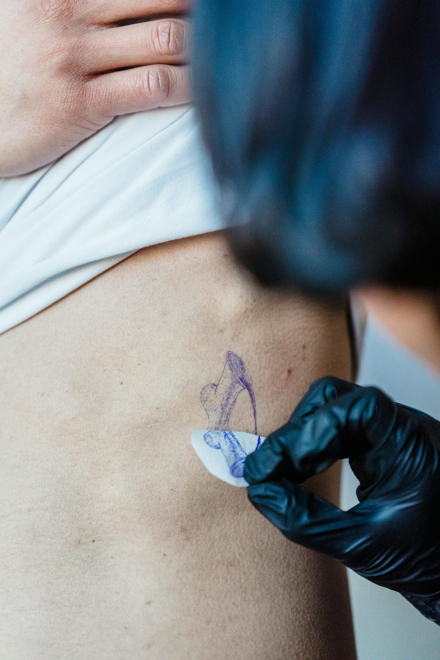
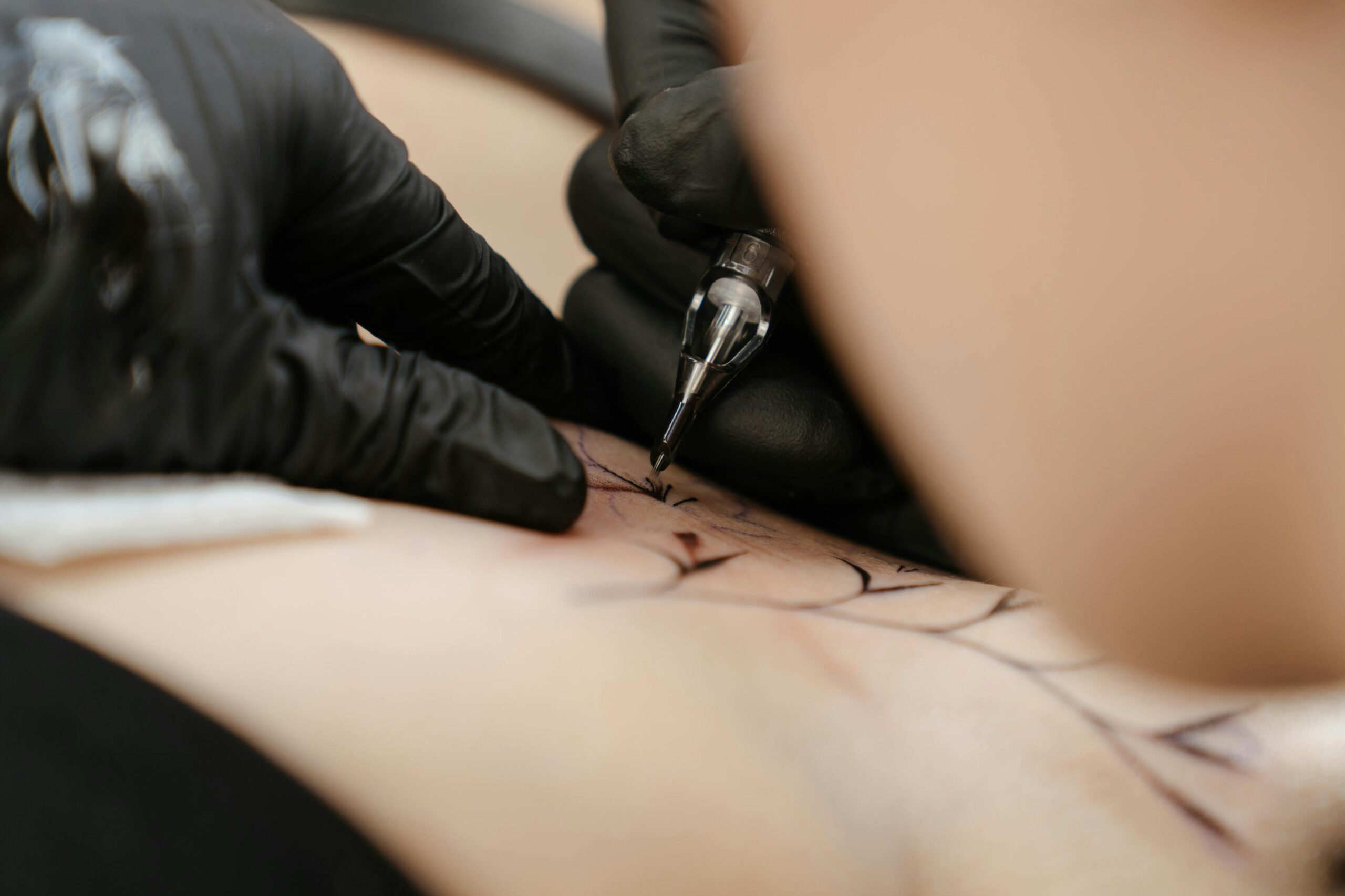
The stencil translates the reference onto skin and serves as your guide during the tattooing session:
Trace the key lines: Capture the major structural edges — the hairline, eye sockets, nose outline, jaw definition — as your foundational reference lines. These lines don’t need to show tonal information; they’re position guides.
Mark dark zones: Lightly indicate the areas of deepest shadow on your stencil. This prevents you from losing your tonal map once you’ve transferred to skin and the visual reference is less immediately accessible.
Scale correctly: Print your stencil at the correct size for the placement. Check the scale against the body part before applying — a face that’s too large or too small for its placement will look immediately wrong regardless of technical quality.
During the Session: Staying Referenced
Once you begin tattooing, the reference should remain constantly visible. Position it at approximately the same orientation as the tattoo on the client so you’re not constantly mentally rotating and transposing.
Experienced artists check their reference frequently — not occasionally. After every few minutes of work, step back, look at the reference, look at your work, and identify where the most significant gap is. Systematic comparison prevents errors from compounding. Resist the instinct to proceed from memory. Even experienced artists using subjects they’ve tattooed dozens of times refer constantly to their reference — not because they can’t remember what a nose looks like, but because accuracy comes from consistent comparison, not memory.