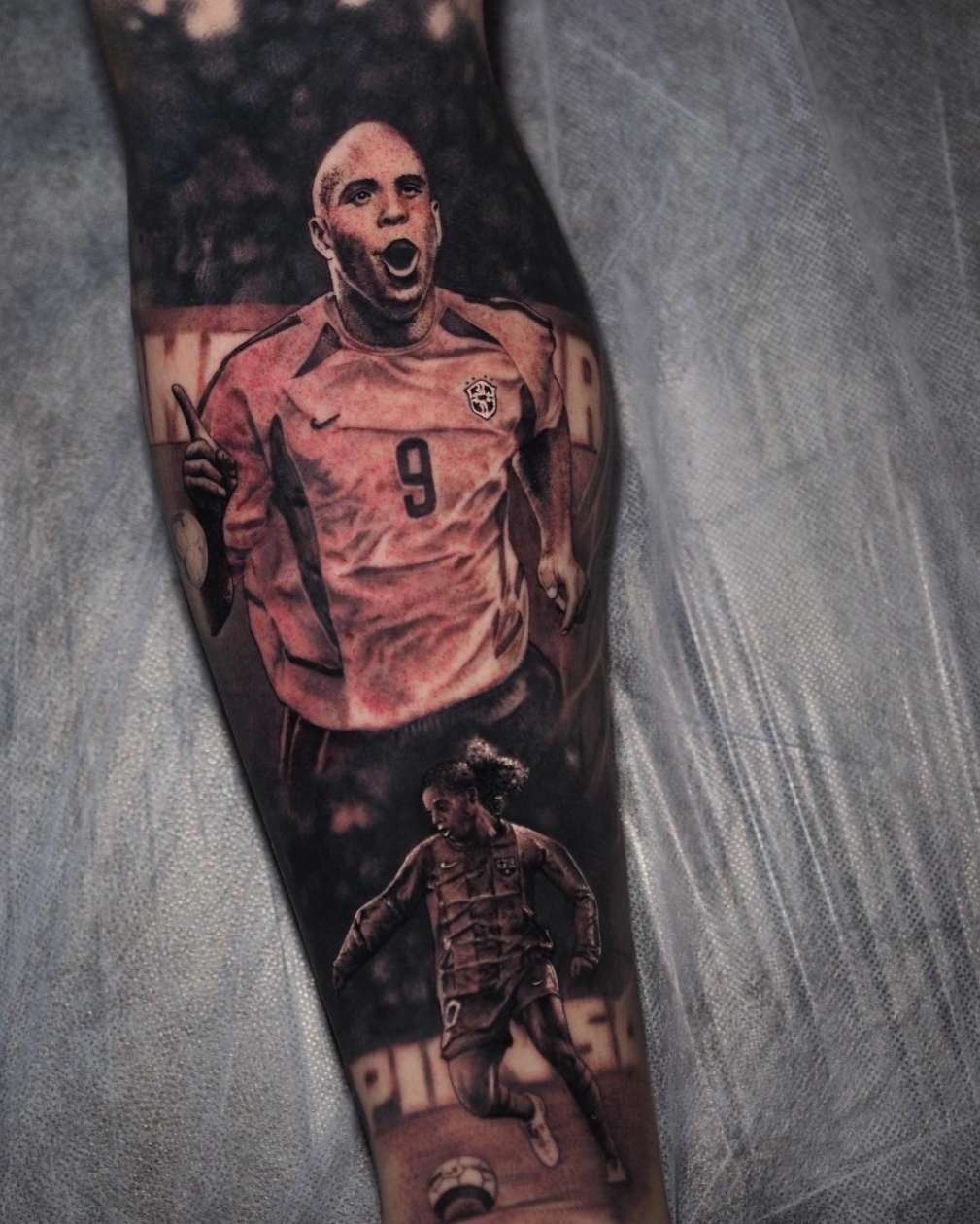
Portrait tattooing sits at the apex of the realism discipline. To place a recognisable likeness of a person’s face — accurately, permanently, on skin — requires a convergence of technical skills that takes most artists years to develop. But the artists who get there find themselves in one of the most rewarding and lucrative niches in the industry.
This guide breaks down the core competencies that portrait tattooing demands, how each is developed, and how to approach your training if portraiture is where you want to go.
Why Portraits Are the Ultimate Technical Test
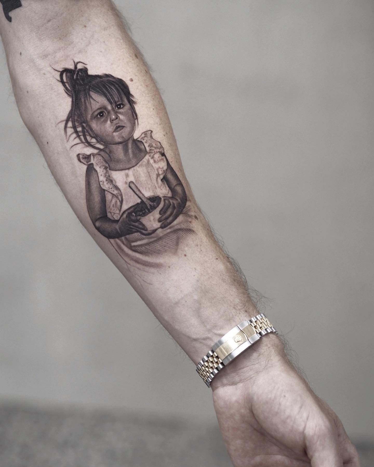
The human brain is extraordinarily sensitive to faces. We are wired to detect subtle deviations from normal facial proportions — a misplaced eye, a slightly wrong nose width, an expression that doesn’t quite match the reference. This hyper-sensitivity to facial accuracy is what makes portrait tattooing so technically demanding.
With a landscape or an abstract design, small deviations from a reference are often invisible or irrelevant. With a face, small deviations produce a result that doesn’t look like the subject — and in memorial portrait work in particular, that’s a devastating outcome for the client.
This is also why mastering portrait tattooing builds your technical capabilities across the board. If you can execute a face accurately, you can execute almost anything.
Facial Proportions and Likeness
The first skill a portrait artist must develop is an accurate understanding of facial proportions — and specifically, the ability to spot deviations from those proportions quickly.
The classical rules of facial proportion (the eyes sit at the midpoint of the head, the nose base aligns with the bottom of the ears, the mouth sits one-third of the way between nose and chin) give you a checklist for evaluating your stencil before you ever touch the client. If the stencil contains a structural proportion error, the tattoo will have that error — permanently.
Developing this eye requires deliberate practice drawing faces from reference — not just tracing, but studying and reconstructing. Life drawing classes, anatomy study, and spending time drawing portraits from photographs all accelerate this capability.
Tone Mapping: The Foundation of Realism
Portrait realism lives and dies on tone mapping — the process of translating the light and dark values of a reference photograph into the ink values you’ll lay down on skin.
Every portrait begins with a reference photograph. Before the needle touches skin, you need to have clearly identified: the darkest areas (deep shadows, usually in eye sockets, under the nose, under the chin), the lightest areas (forehead highlights, the tip of the nose, cheekbones in direct light), and the midtones that create the transitions between them.
Many artists translate their reference into greyscale digitally before creating their stencil, and then further mark up the dark, mid, and light zones. This gives you a visual guide that separates the complexity of likeness from the complexity of tonal execution — you’re tackling each challenge separately.
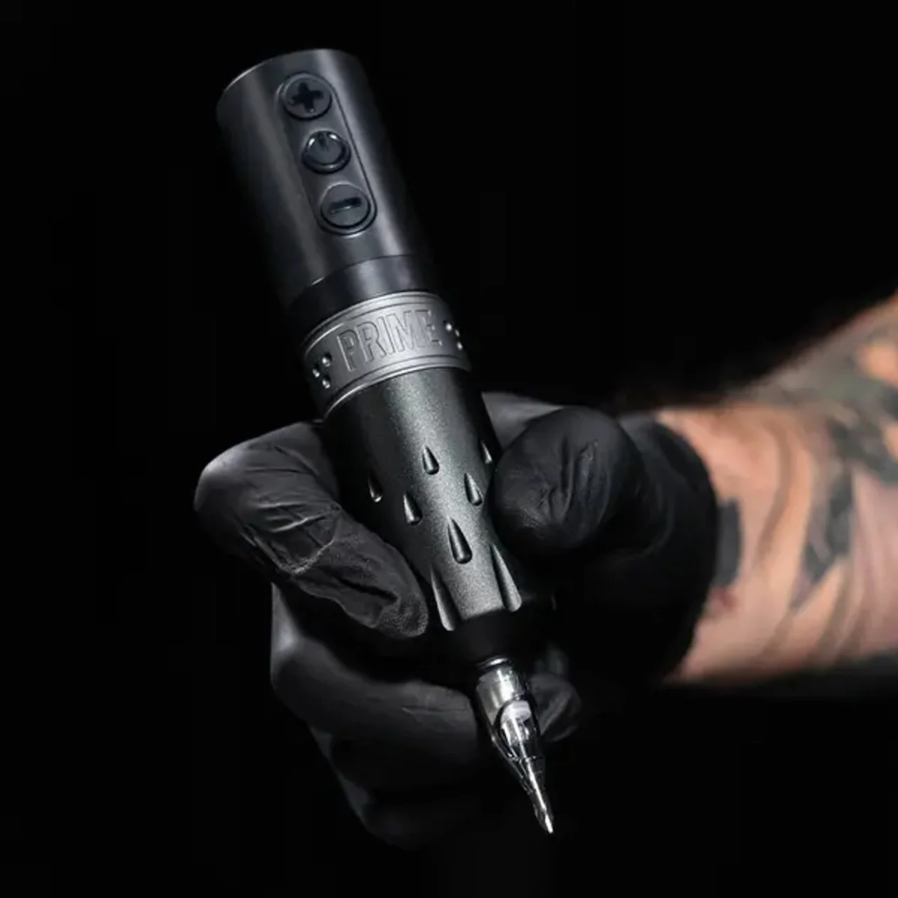
Needle Technique for Portrait Work
Curved magnums are the workhorse: For smooth gradient work in skin — cheeks, foreheads, necks — curved magnum needles (also called soft mags) allow a rocking motion that deposits ink gradually and consistently. Flat shaders create harder edges, which are useful for high-contrast areas but produce visible lines if used carelessly in gradient transitions.
Whip shading: A critical technique for portrait soft transitions, whip shading involves pulling the needle away from the skin at the edge of a shaded area to taper the ink deposit. Developing a consistent whip takes significant practice on synthetic skin before it becomes reliable.
Layering discipline: Realism portraits are built up in controlled layers — never rushing to finish, never overworking an area. The instinct to add more ink to fix a problem area is one of the most common mistakes in portrait work and often makes the problem worse. Work methodically, step back frequently, and let each layer settle before assessing.
Reference Photography: What Makes a Good Portrait Tattoo Photo
The quality of your reference photograph directly determines your ceiling for the finished tattoo. Poor reference produces poor tattoos — no amount of technical skill can compensate for a blurry, poorly lit, or low-resolution photograph.
For client portrait work — particularly memorial tattoos — you’ll often be working with whatever photograph the client provides. When possible, guide them toward selecting:
• High resolution (phone cameras from the last five years are usually fine) • Clear, direct lighting (avoid harsh flash directly on the face or deep backlighting) • Sharp focus on the face (slight blur on background is acceptable; blur on the face is not) • A neutral or simple background that doesn’t compete with the subject • An expression that captures the essence of the person — memorial portraits in particular should feel alive and warm
When you receive a suboptimal reference, communicate clearly with the client about what’s possible. Setting honest expectations before you begin is far better than explaining why the finished result doesn’t look exactly like the photo.
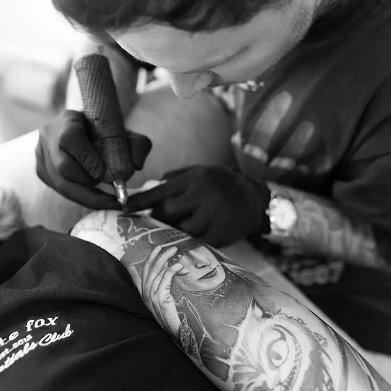
Building Your Portrait Practice on Synthetic Skin
No serious portrait artist starts their first client piece without extensive practice on synthetic skin. Portrait work requires too many simultaneous technical demands to be learned reactively on a live person.
A systematic approach: begin with simple reference photographs — single face, direct light, clear features. Work through the full process: create your stencil, tone-map your reference, execute the piece in greyscale layers on synthetic skin. Photograph the result and compare it to the reference. Identify the largest gap between the two and focus your next practice session specifically on addressing that gap.